Timeline: Sept 2024–Mar 2025
Team: WaterlUX (8 designers)
My Roles: Project Manager, Client Liaison, User Research Facilitator, Prototyper
The Challenge
Residents in the Region of Waterloo relied on dozens of online forms that were inconsistent, difficult to navigate, and not fully accessible. Forms were often abandoned due to poor mobile optimization, confusing layouts, and redundant inputs.
How might we create a standardized, accessible, and intuitive online form experience for residents, one that respects diverse user needs, reduces friction, and aligns with the Region’s upcoming digital services portal?
My Role
I wore multiple hats throughout this project:
- Leadership: Co-managed the project scope and deliverables, created the Gantt chart, and tracked deadlines.
- Client Collaboration: Acted as the main point of contact, coordinating meetings, gathering feedback, and aligning our work with stakeholder expectations.
- Research: Designed and facilitated surveys, interviews, and a modified card-sorting activity. Created consent forms and synthesized insights into key pain points.
- Design: Co-created low-, mid-, and high-fidelity prototypes in Figma, focusing on accessibility, clarity, and user flow.
Process
We followed a blended Design Thinking / Double Diamond approach, iterating through research, definition, ideation, prototyping, and testing.
Research & Empathy
- Conducted surveys and interviews with residents.
- Learned that users struggled with redundancy, unclear instructions, and lack of mobile optimization.
Define
- Key problem: forms weren’t standardized, causing frustration and drop-offs.
- Design goals: improve findability, accessibility, and mobile usability.
Ideate
- Built personas and journey maps.
- Sketched storyboards and drafted wireframes focused on reducing cognitive load.
Prototype & Test
- Created low → mid → high-fidelity prototypes in Figma.
- Ran usability tests with think-aloud protocols, walkthroughs, and A/B comparisons to the existing forms.
- Iterations led to simplified layouts, progress indicators, and clearer input structures.
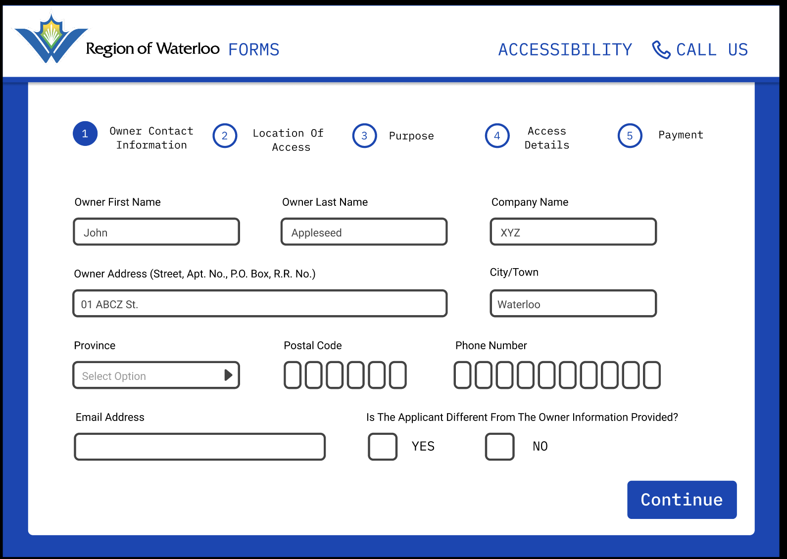
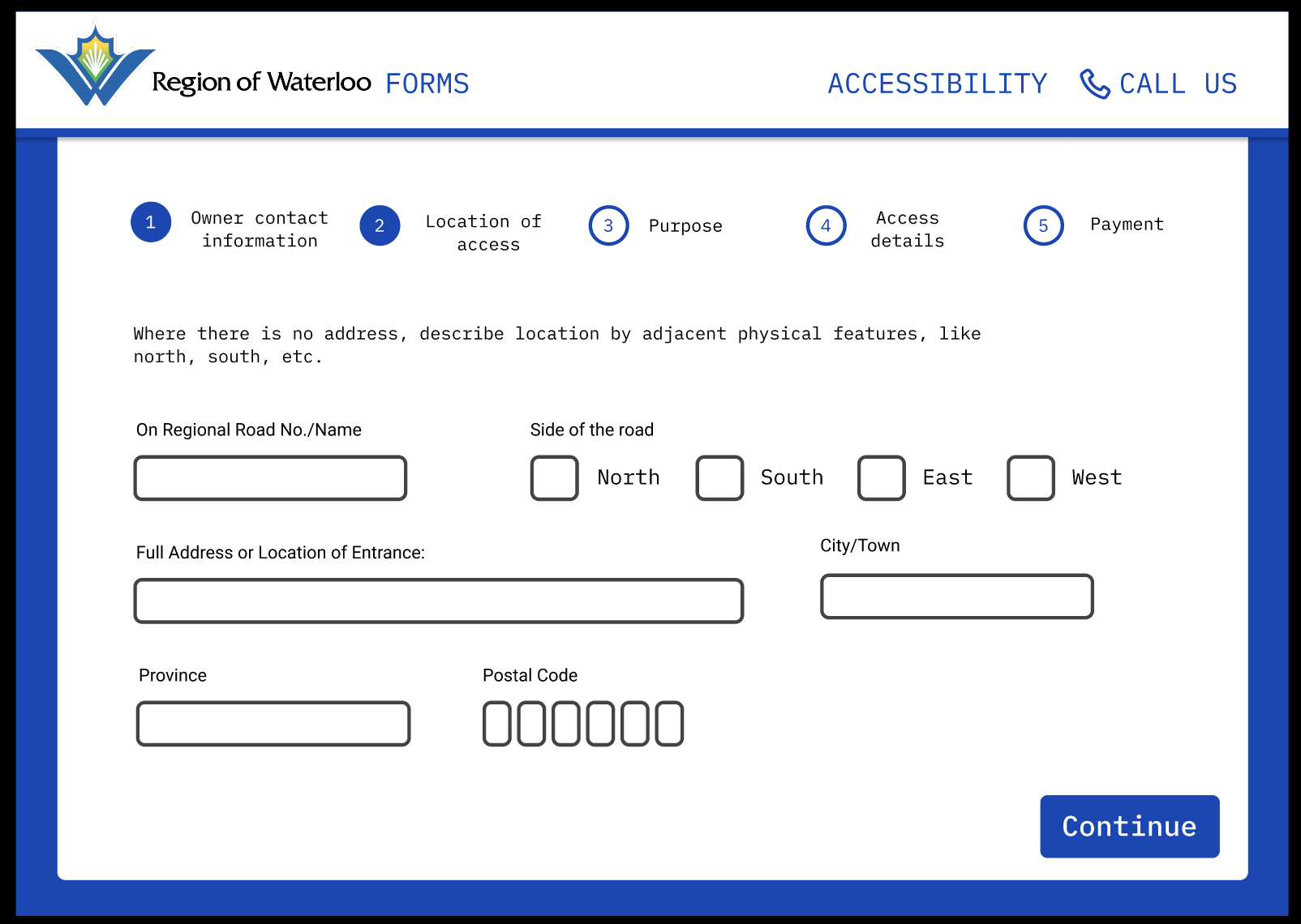
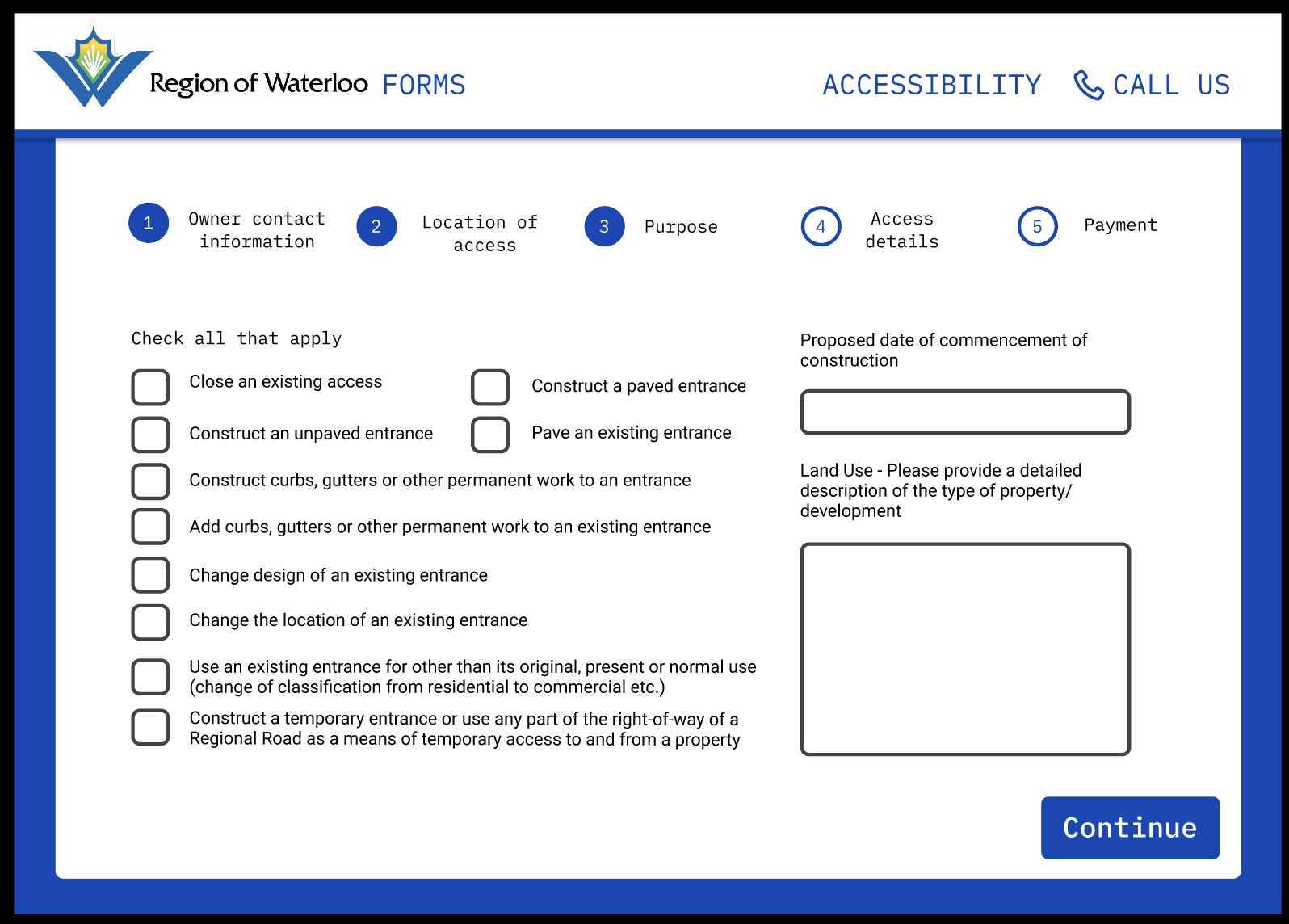
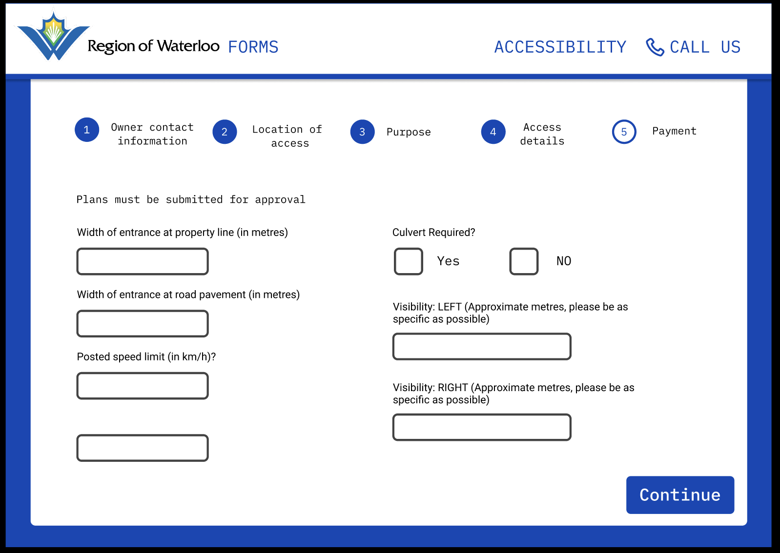
Prototype Evolution
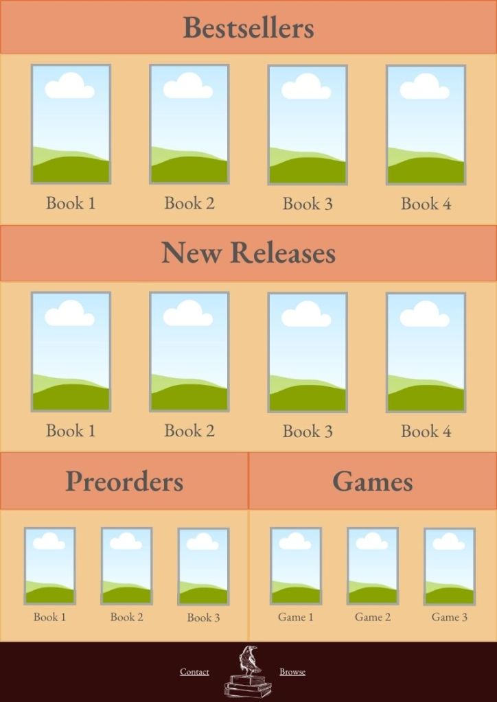
Mid-Fidelity
- Structured flow guiding users step by step.
- Focused on layout and reducing redundant fields.
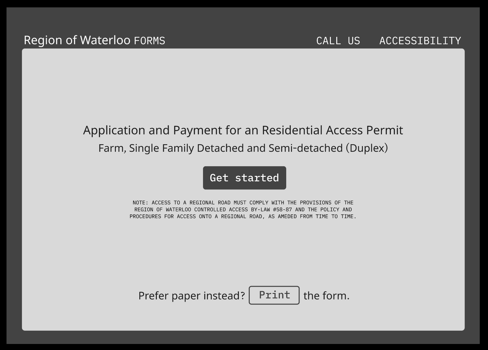
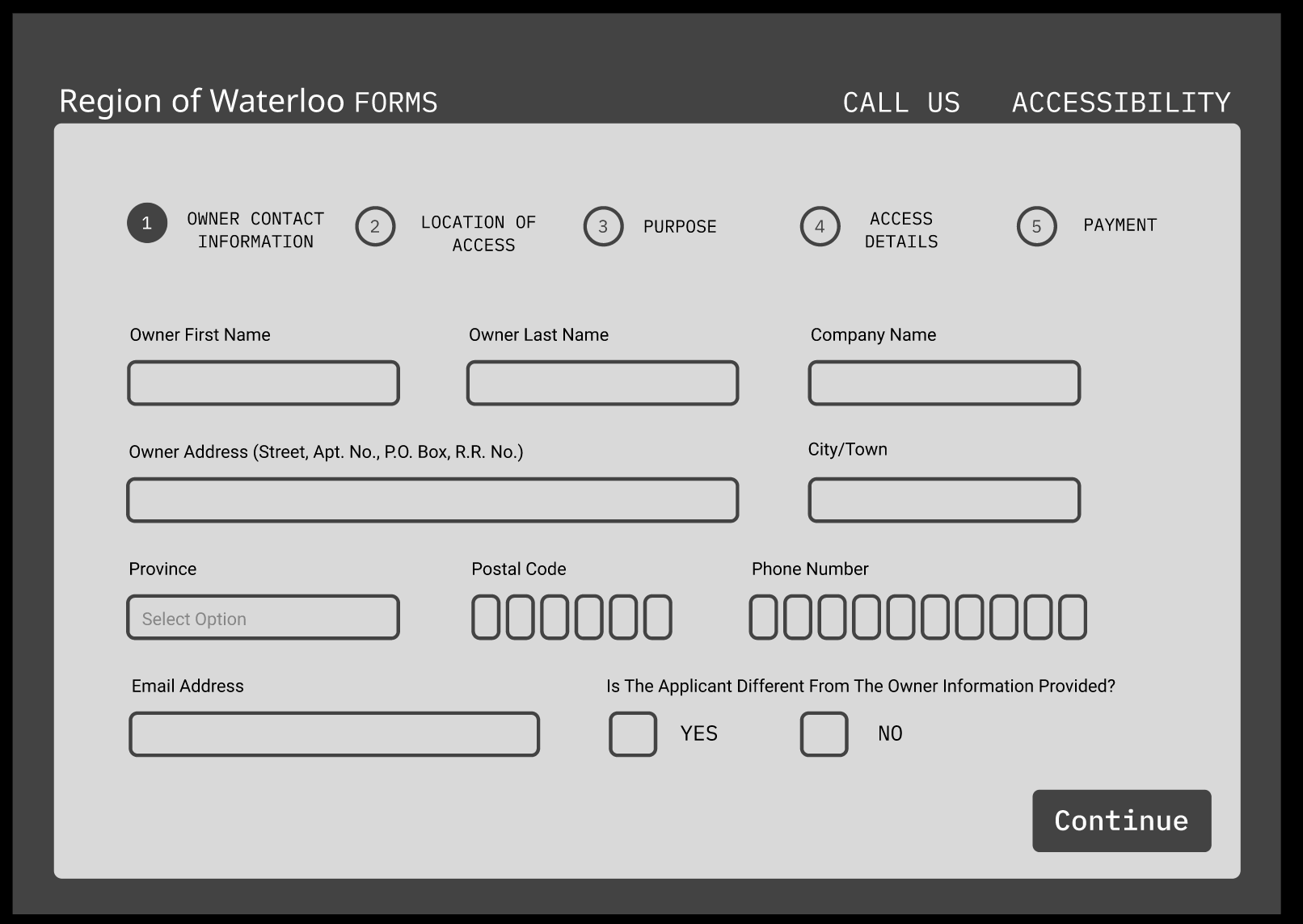
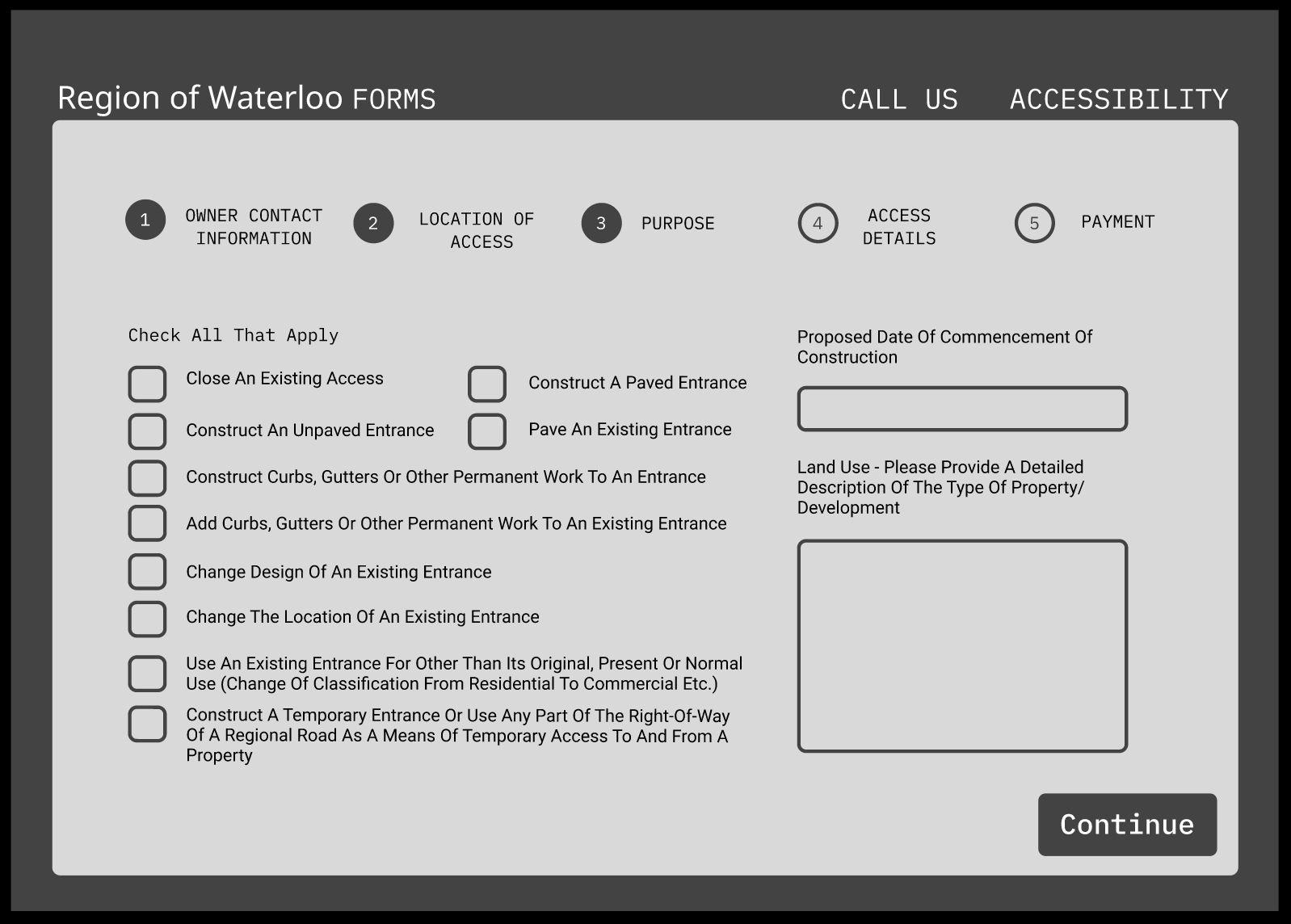
Mid-Fidelity prototype simplified the flow and reduced redundant fields, making it easier for users to progress without confusion.
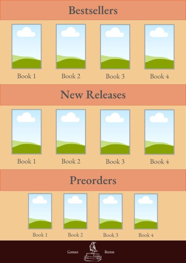
High-Fidelity
- Finalized branding and responsive design.
- Accessible input fields, improved error states, and confirmation steps.
- Mobile-first adjustments: larger tap targets, reduced scrolling, and simplified navigation.
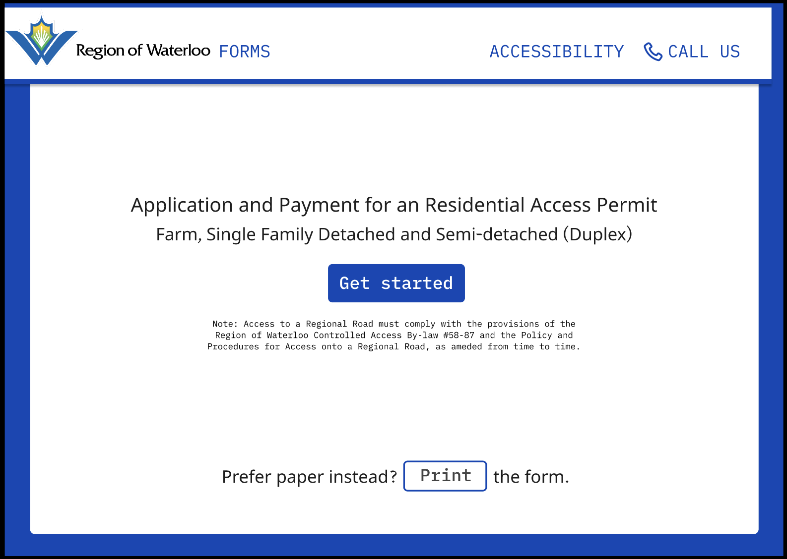
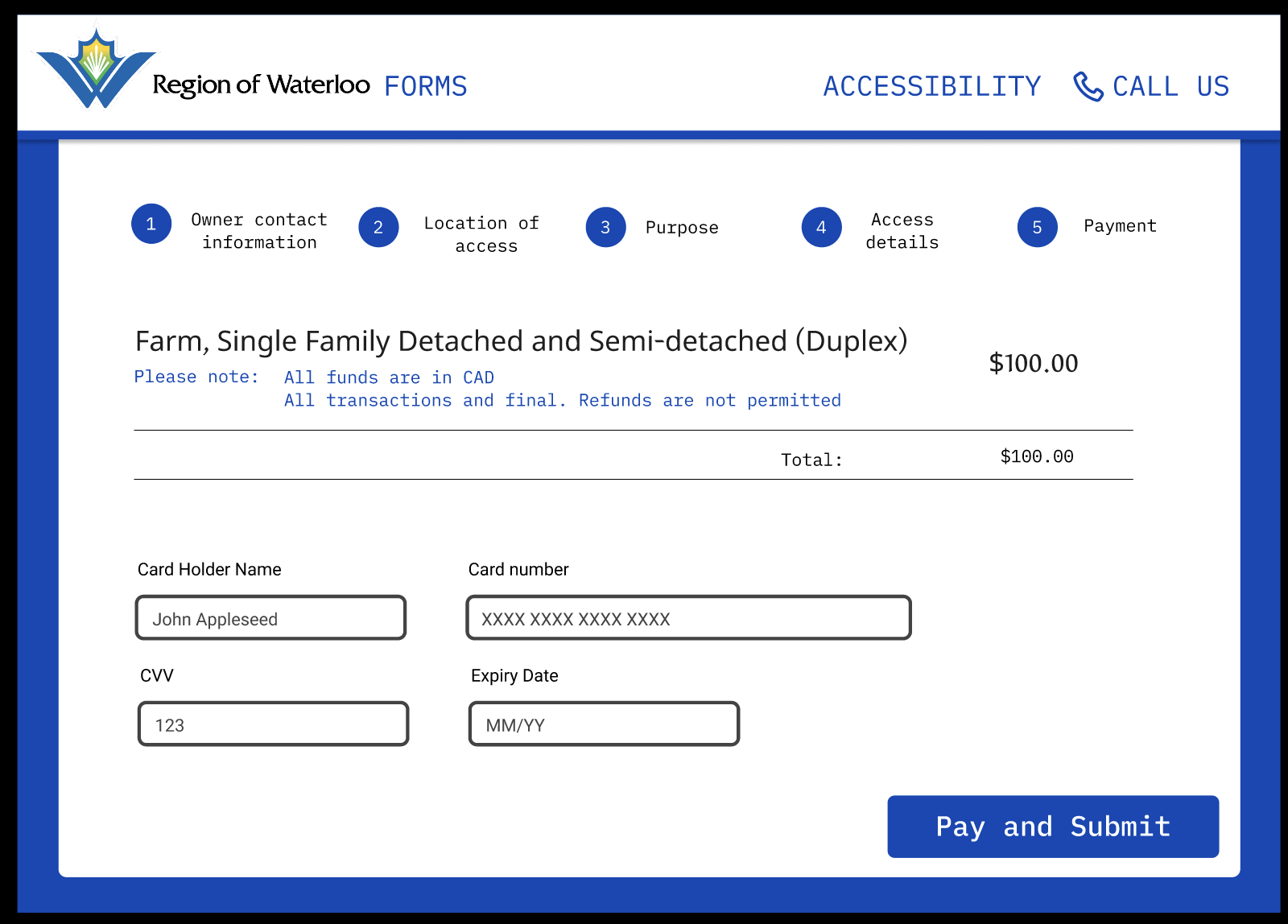
High-fidelity prototype with accessibility features and a new confirmation flow that reduced user drop-offs.
Final Outcomes
We delivered a responsive, scalable form template for the Region of Waterloo:
- Accessibility: WCAG 2.2 compliance with strong color contrast, font resizing, simplified language, and assistive tech compatibility.
- Consistency: Standardized structure for forms across departments.
- Usability: Progress indicators, auto-fill/address lookup, and confirmation messaging.
- Mobile Optimization: Tap-friendly inputs and reduced scrolling for smaller screens.
- Scalability: A design system that can extend to multiple form types.
Stakeholders at the Region expressed interest in incorporating our designs into their upcoming digital services portal.
Challenges
- Recruitment: Limited participant pool meant we had to lean on personal networks to test.
- Balancing Priorities: Negotiating between user needs and stakeholder requests required frequent communication and compromise.
What I Learned
This project sharpened both my design and leadership skills:
- Accessibility isn’t an add-on, it’s a design foundation.
- Real client work means balancing feasibility, timelines, and user needs.
- Communicating insights clearly to stakeholders is just as important as designing screens.
Presenting to Region staff during a final showcase reinforced the value of process-driven design and gave me confidence in stakeholder-facing communication.

 Megan McMullen